Analytical Paragraphs- Introduction and how to write an Analytical Paragraph
The Writing Section asks students to write an analytical paragraph about a given map, chart, graph, cue, etc. In CBSE class 10 students will be asked to write an analytical paragraph on very common topics based on the following types of hints:
Tables , Bar Charts , Bar Graph , Line Graph , Pie Chart , Maps , Reports
Maximum Marks for Analytical Paragraph in CBSE – 5
Word Limit for Analytical Paragraph in CBSE – 100 to 120
Format of an Analytical Paragraph-
Introduction
Body
Conclusion-
Above are the three main aspects of the format of analytical paragraph. Additionally, we would like to say that When it comes to crafting the perfect analytical paragraph, one of the most important things is having a well-structured data which is the best format.
In this article, we will be taking a deep dive into the analytical paragraph format, exploring how it helps you organize your thoughts and make your argument more convincing. Plus how it maintains your percentage in Class 10 CBSE Board Exam.
Analytical Paragraph Structure- Let’s dive deeper to understand analytical paragraph format in a better way-
A brief introduction- The subject of Tables , Bar Charts , Bar Graph , Line Graph , Pie Chart , Maps , Reports should be explained. You need to be brief while writing this section.
The body of Analytical Paragraph- this is the most detailed paragraph of an analytical paragraph. Explain the given graph in detail, using the given figures is always advised but remember not to add your own data because this is a small piece of writing and additional data may exceed your word limit. You can find percentage with the given input that looks attractive. Some attractive phrases are given below, you can use them to make your paragraph look more professional-
Following a few tips for analytical paragraph. Your A few suitable and decorative words for your answer are-
• The given chart shows………
• This chart illustrates
• The data presented before us clearly states.
• We see that from year XXXX to XXXX it remained in trend
I think that with these tips for analytical paragraph you will surely be able to get good marks.
Conclusion- Conclude the paragraph with a summary or overall view of the graph
Here we Come to Analytical Paragraph Class 10 Samples
Question- 1 The following bar graph shows the number of men and women students studying in engineering colleges in Delhi from 2000 to 2020. See the graph carefully and explain in your own words what it explains.
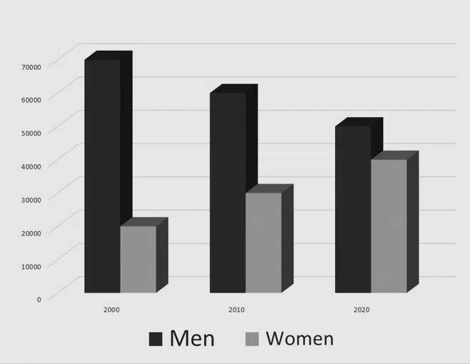
Answer- From 2000 to 2020, the bar graph shows the number of students studying engineering in Delhi, both men and women. After analysing the chart, it becomes apparent that there has been a steady decline in the number of male students in Delhi engineering colleges over the years.
Between 2000 and 2020, the number of male engineering students in Delhi steadily/regularly decreased by 10000. At its highest point in the year 2000, their number stood at 70,000. Over the course of the two decades this figure dropped to 50000. In contrast, female students saw an impressive growth, increasing by 50% from 20000 to 40000. Despite this sharp rise, male students still maintained a larger share of engineering students over the period. Nevertheless, when looking at both sexes combined the total number of engineering students remained unchanged.
Download the above Question in PDF (Printable)
Let’s read another analytical paragraph questions for class 10th to better understand-
Analytical Paragraph Solved Example Based on Bar Graph
Question- 2 Given above is the bar graph that represents the Total Sales Turnover of four major corporate giants of India. The figures shown record the total sales turnover in 3rd Quarter (September to December) and 4th Quarter (January to March). Summarise and write an analytical paragraph highlighting the general features and necessary details. Compare where you feel relevant.
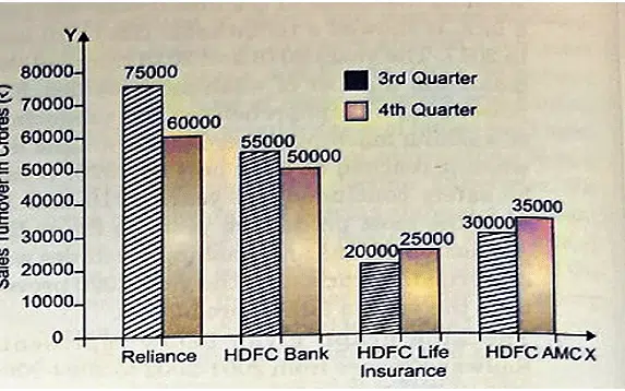
Ans. The bar graph demonstrates that all four corporate giants didn’t demonstrate a consistent pattern. Reliance had witnessed a steep decline in their 4th Quarter sales turnover, going from 75000 crores to 60000 crores. HDFC Bank’s sales fell slightly by 5000 crores in the fourth quarter, whilst the trend reversed with HDFC Life Insurance and HDFC AMC both recording a growth of 5000 crores each during the same period. In line with this, HDFC’s third-quarter sales turnover of 20000 crores rose to 25000 crores in the 4th Quarter and HDFC AMC’s 30000 crores in the third quarter rose by 5000 crores to 35000 crores in the 4th Quarter. Nevertheless, the sharpest decrease occurred for Reliance where it went from 75000 to 60000 crore.
Download the above Question in PDF (Printable)
Analytical Paragraph Solved Example Based on Bar Graph
Question- 3- The bar chart given below illustrates the total Foreign Direct Investment (FDI) into India from all over the world. Summarise and write an analytical paragraph selecting the main features and giving all the necessary details. Compare where you find it relevant.
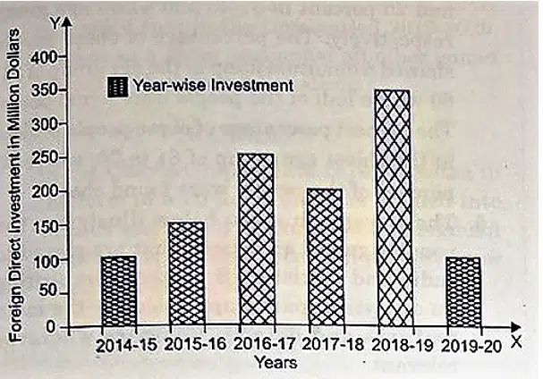
Ans. The bar chart given above depicts the Foreign Direct Investment (FDI) into India from 2015-16 to 2019-20. It is clear that the rate of investment didn’t follow a uniform trend, but instead went through several changes. There was an especially large surge in 2018-19, when it increased by 150 crores to reach its highest value of 350 crores. Unfortunately, this was soon followed by the sharpest drop in 2019-20 when it plummeted to only 100 crores.
The first three years were moderately successful – with a steady increase from 100 crores in 2015-16 to 250 crores in 2017-18. However, there was again a dip in 2018-19, before climbing back up to its peak at 350 crores.
Finally, some unusual circumstances seem to have been responsible for causing the dramatic decline from 350 to 200 crores! To sum up, FDIs vary depending on financial conditions and foreign investor’s interests.
Download the above Question in PDF (Printable)
Solved Analytical Paragraph Questions for Class 10th
Question- 4. The chart below shows the expenditure of two countries X and Y on consumer goods in 2020 in US million dollars. Summarise and write an analytical paragraph highlighting main features and necessary details. Compare where relevant.
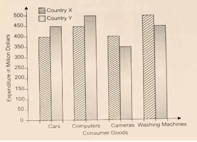
Ans. The Bar chart given above demonstrates the money expended by X and Y on consumer items such as cars, computers, cameras and washing machines in 2020. Both countries’ expenses were not consistent overall. With regards to cars, X laid out $400 million whereas Y paid $450 million; the same was the case for computers.
Yet, regarding cameras it was X that released $50 million more than Y. When it comes to washing machines, similarly, X spent $500 million while Y expended only $450 million – a difference of $50 million between them. An interesting aspect is that, on all four objects of necessity they expend almost the same amount of cash – a steady allowance of $50 million between them.
It is reasonable to state that their expenditure on consumer goods appears to be quite close with no wild increases or decreases.
Download the above Question in PDF (Printable)
Analytical Paragraph Solved Example Based on Bar Graph
Question- 5- The chart given below illustrates the weight measurements of people in the United States of America in 2020. Summarise the information in an analytical paragraph by selecting and reporting the main features. Make comparisons where relevant.
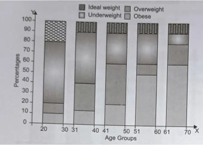
Ans. The bar graph given above indicates that the age group of 20-30 generally represents ideal weight measurements, with 60% of respondents fitting this category. Following this age group, ideal weight among those aged 31-40 declined by 10%, to 50%. The percentage of those at ideal weight in the 41-50 and 51-60 age groups remained the same at 35%.
The oldest age group (61-70) showed the lowest percentage of those at ideal weight (10%), while the youngest age group (20-30) had the highest proportion of underweight people (20%). In subsequent age groups, only 5% were found underweight. Conversely, in terms of overweight people, the youngest age group had only 10% that were overweight; 45% and 50% were found in the 41-50 and 51-60 age groups, respectively; and 20% and 60%, respectively, were seen in the 31-40 and 61-70 groups.
Obese people formed a higher proportion as one moved up an age group, beginning at 10% among those aged 20–30 before increasing to 15%, 25%, 45%, 50%, 20%, and culminating in 60% among the oldest respondents (61–70).
Download the above Question in PDF (Printable)
Analytical Paragraph Class 10 Samples
Analytical Paragraph Solved Example Based on Bar Graph
Question- 6- The Bar graph given below illustrates the popular games and sports that are played in India and Pakistan. Summarise by writing an analytical paragraph selecting the main features and details. Compare wherever relevant.
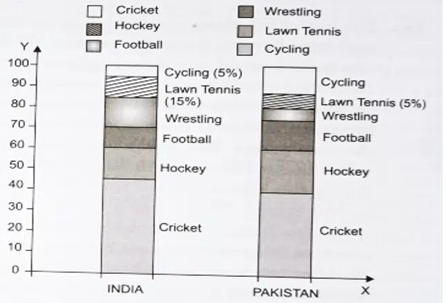
Ans. The data shown in the bar graph illustrates that Cricket is the most sought-after game amongst Indian and Pakistani sportsmen in 2019-2020.
In India, it is almost a religion; 45% of people partake in this game, whereas in Pakistan it stands at 40%. Hockey is no longer as popular as before in either country; in India 15%, and Pakistan 20% of people play this sport. Interestingly, Football has gained more traction in Pakistan with 5% more players than its neighbour. Wrestling seems to be equally enjoyed by Indians and Pakistanis, but there is a difference – only 5% of sportsmen from the latter opted for it. On the other hand, Lawn Tennis has been thrice more popular among Indian than Pakistani players. Cycling had a higher percentage among Pakistanis; albeit only 5%, compared to India’s lower 3%.
Clearly, Cricket still reigns supreme over all other games including Hockey and Wrestling across both countries.
Download the above Question in PDF (Printable)
Let’s go for another analytical paragraph questions for class 10th
Question- 7- The following pie chart shows the foreign Direct Investment in India during 2019-2020. Write an analytical paragraph showing the general trends and the necessary details. Compare the segments where relevant.
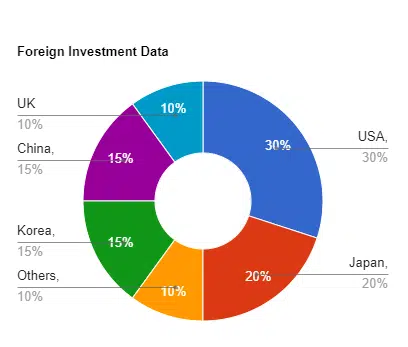
Ans. The pie chart shows the Foreign Direct Investments (FDIs) by different nations in India during 2019-2020. The US emerges as the dominant investor, with a 30% share. This is followed by Japan, whose FDI accounts for 20%. China and Korea also made a notable contribution of 15% each, while UK’s share stood at 10%. Other countries combined to make up the remaining 10%.
It can be observed that after excluding US, Asian countries such as China, Japan, and Korea were responsible for half of all FDIs. On the other hand, other nations from around the world contributed more than United States’ share of total FDIs in India.
Download the above Question in PDF (Printable)
More Examples for Analytical Paragraph
Question- 8 The following pie chart represents the sales of mobile phones of the leading companies of the world in India. Summarise and analyse the chart in your own language. Give all necessary details and compare the segments where relevant.
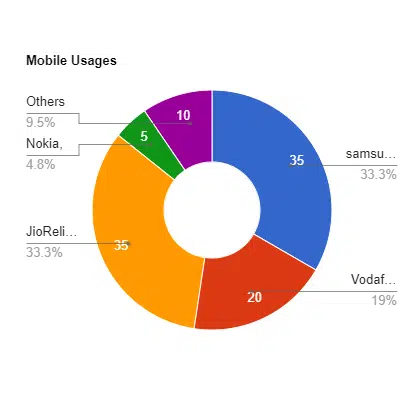
Ans. The given pie graph reveals the sales percentages of the top mobile phone companies in India. Samsung remains at the top, holding a 35% share of consumers. Its dominance is being challenged by Reliance’s Jio, which has gained a 30% portion of the market – an impressive feat. Vodafone maintains its place near the top with 20%, while Nokia drops significantly with only 5%. The remaining 10% is taken up by other brands, showing that Jio is not the only local success story – foreign companies are still contending for market dominance. While Samsung is far above the competition, it has earned only seven times more than what Nokia currently holds.
Download the above Question in PDF (Printable)
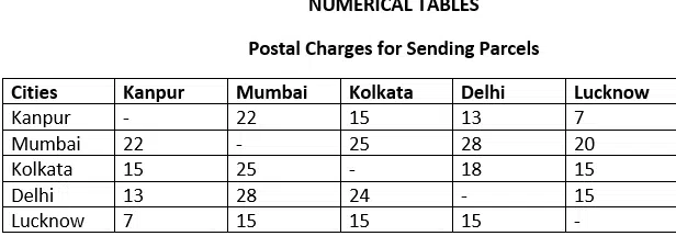
Question- 9- Read the table given above that describes postal charges among five main cities of India, Kanpur, Mumbai, Kolkata, Delhi and Lucknow. Write a critical and analytical description. Compare and contrast them wherever possible.
Ans. In the table above are the postal charges for sending parcels to the five major cities in India, as well as a comparative study.
A general trend indicates that parcel rates are determined by the distance to various cities in India. The charges from Delhi to Mumbai or from Mumbai to Delhi are the highest. Do they reflect the distance? Kanpur to Kolkata and vice versa are charged at रु15.
Lucknow offers lower prices than most other cities, with the average cost per journey being only रु 13. Especially economical are journeys to and from Kanpur, averaging at just रु 7. The least affordable postal fares are generally between Mumbai and the other cities, with the charge averaging at रु 23.75. Meanwhile, trips between Delhi and Kanpur come in second place for lowest cost at just रु 13.
The distance between cities determines the postal charges for sending parcels.
Download the above Question in PDF (Printable)
Question- 10- The table below gives information about some of the world’s most studied languages. Give an analytical description in a paragraph highlighting and reporting the main features. Don’t forget to make comparisons where relevant.
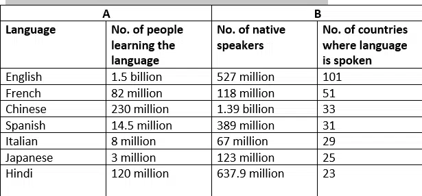
Ans. There are some revealing facts about the seven most popular languages in the world that are displayed in the following table. The table allows a comparison between the number of people who study a language versus those who speak it as a mother tongue. There are also many countries that speak both A and B.
The dominance of English is quite apparent. 1,5 billion people are learning English all over the world. Chinese and Hindi, here, hold poor second and third positions. 230 million and 120 million people are learning Chinese and Hindi, respectively. 82 million people are learning French, which is the fourth most popular language.
With 1.3 billion native speakers of Chinese and 640 million native speakers of Hindi, Chinese dominates. With 527 million native speakers, English is a poor third, while Spanish holds fourth with 389 million, pushing French at number 4 with 118 million native speakers. Italian and Japanese come in at the bottom of the list with only 118 million native speakers.
English is unrivalled as a universal language, being used and studied in over one hundred countries. French and Chinese also have an extensive presence, with 51 and 33 countries respectively. Spanish, Italian, Japanese, and Hindi are spoken in 31, 29, 25, and 23 nations respectively but English remains ahead of all the others combined. While Chinese is gaining popularity among learners, Hindi is more popular than the other three languages taken together. The prevalence of English is undisputed worldwide.
Download the above Question in PDF (Printable)