Wondering how to excel in analytical paragraph writing? This guide provides you with all the essentials, including analytical paragraph class 10 solved examples PDF. Read on to become an expert in writing analytical paragraphs.
How to write an Analytical Paragraph? You must include the following things while writing in an analytical paragraph…
You must include the following things while writing in an analytical paragraph-
Introduction to Analytical Paragraph Writing
The Introduction must introduce the central subject or issue that has been asked in the question itself. In other words, you can find the Introduction in the question itself.
Understanding the Overall Viewpoint in Analytical Paragraph Writing
Describe in detail what you understand based on the given input. This can be said to be the description of Details
Crafting a Strong Conclusion in Analytical Paragraph Writing
In this part you must sum up by telling an overall impression of the given input. Here you need ensure that you don’t repeat the same language which you have used in the earlier part of your answer.
Class 10 CBSE Solved Examples for Mastering Analytical Paragraph Writing
Analytical Paragraph Writing Based on Line Graphs: A Guide
What is a line Graph- A line graph is a type of chart that tracks changes in data over time. It displays information in the form of a series of connected points, each representing a value on a particular axis. Line graphs are commonly used to show changes in one or more variables, and can be very effective tools for tracking trends in data. With Edumantra’s analytical paragraph practice questions based on line graph, you can learn to score better in CBSE class 10 Board Exam-
Following is an example of line graph-
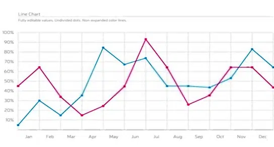
Expert Tips for Analytical Paragraph Writing on Line Graphs
Use the following phrases to explain the contents of a line graph-
If the line goes upward from one to the other point use the following words:
• We observe a growth
• A clear rise is seen
• A climb up in the line is seen
• an increase is apparent
If the line goes downward from one to the other point use the following words:
• We observe a fall
• A clear decline is seen
• A coming down in the line is seen
• a decrease is apparent
Most Important tip for Effective Analytical Paragraph Writing
All of you have to remember that there is no limit of explanation so there is no need to show extra talent. Be in the word limit. Writing unnecessarily irritates the examiner and wastes your time also. So be wise.
Solved Questions Based on Line Graph
Let’s read some Analytical Paragraph Class 10 Solved Examples PDF
Question- 1- The graph shows the recent technological revolution in India in recent years. Summarise the information by selecting and reporting the main features. Make comparisons where necessary.
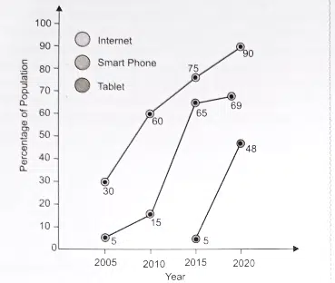
Ans. The line graph provided above demonstrates the sudden emergence of a technological revolution in India from 2005 to 2020, spanning fifteen years.
Utilization of communication technology became widespread during this time period. The Internet and Smartphone increased at a dramatic rate starting in 2005, with the Tablet joining in 2015. From 30 percent use of the Internet in 2005, it jumped to 60 percent by 2010 – an impressive growth of 100 percent.
Further rising to 75 percent in 2015 and reaching its peak at 90 percent in 2020 indicated that nine out of ten Indians were using the Internet by then. The Smartphone made a modest beginning at 5 percent but surged to 15 percent by 2010, subsequently skyrocketing up to 65 percent.
This was followed by a steady increase from 65 percent in 2015 up to 69 percent by 2020. Lastly, the Tablet entered late into this communication revolution but still showed considerable growth within only five years period between 2015 and 2020.
It started modestly in 2015. However, by 2020 it shot up to 48 percent. By 2020, one out of two Indians were using tablets. The communication revolution in India took place suddenly and rapidly. As long as it continues like this, every Indian will be a part of it.
Download the above Question in PDF (Printable)
Solved Example of Analytical Paragraph Based on Line Graph 2.
Question- 2- The line-graph chart given below breaks down the sales history of the famous Lifebuoy brand in soap in the first six months of the year, from January to June. Write an analytical paragraph after selecting and reporting the main features. Make comparisons where necessary.
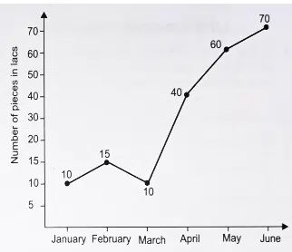
Ans. The chart above depicts the market performance of a well-known Lifebuoy soap in its sales history during the first half of the year. On the whole, winter months had a low sale rate compared to summer periods. January being India’s coldest month results in a reduced number of bathers and, as such, lower usage of soap; this is palpable in its sale figures with only 10 lac pieces sold. Things begin to improve by February with a 50 percent increase yet dip again in March. The chill is nearly gone by April and more bathing leads to an increase in sales.
Frequent bathing has had a demonstrable impact on ‘Lifebuoy’ sales, with 40 lacs pieces sold in April, rising steadily to 60 lacs in May and reaching an unprecedented high of 70 lacs in the summer’s hottest month of June. Given the correlation between weather and soap sales, it is not unreasonable to conclude that demand is greatest during the summer.
Download the above Question in PDF (Printable)
Solved Example of Analytical Paragraph Based on Line Graph 3.
Here is another example of Analytical Paragraph Class 10 Solved Examples PDF
Question- 3- The line graph given below breaks down the number of cars produced in Standard Automobile Company from 2015 to 2020. Summarise the information by selecting and reporting the main features. Make comparisons where necessary.
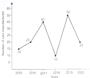
Ans. The line-graph above gives an overview of the production numbers of Standard Automobile Company from 2015 to 2020. In 2015.
A modest 15 lacs cars were manufactured; this number saw a 33 percent growth and rose to 20 lacs in 2016. The following year was incredibly successful as it marked a 100 percent increase with 40 lacs vehicles being produced. Unfortunately, 2018 was the lowest point in the production list with 10 lacs cars being made.
This all changed in 2019 when 50 lacs automobiles were manufactured, and the company reached its peak. But 2020 saw another dip in production numbers that reduced it to 20 lacs again. It’s apparent that during 2016-2017 and 2018-2019, the production was ideal while 2017-2018 and 2019-2020 witnessed the least number of cars being made by the company.
All things considered, large fluctuations were observed in Standard Automobile Company’s automobile manufacturing process over a six year period.
Download the above Question in PDF (Printable)
Analytical Paragraph Class 10 Solved Examples PDF
Question- 4- The line graph given below illustrates the maximum and minimum temperatures in the first ten days of June. Summarise the information by selecting and reporting the main features. Make comparisons where necessary.
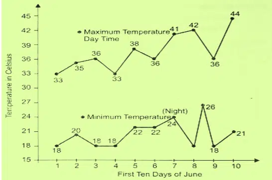
Ans. The line chart demonstrates the highest and lowest temperatures over ten days, from June 1st to June 10th.
Generally, both maximum and minimum temperatures rise on a consistent basis. One exception being June 4th wherein the maximum suddenly falls from 36° to 33°.
The minimum temperature was 18° on 1st June and remained static till it began increasing until 8th June when there was an abrupt drop to 18°, matching its initial value. On 10th June, The hottest day of the ten-day period saw the temperature skyrocket from 36°C to 44°C.
The minimum temperature, however, stayed around 18°C, with only a remarkable surge from June 6 to 8. Taken as a whole, as the month progressed.
It is clear that the maximum temperature had a constant incline and the lower end of it increased from June 5 to 8.
Download the above Question in PDF (Printable)
Analytical Paragraph Class 10 Solved Examples PDF
Question- 5. The line graph given below shows the number of Fans and Washing Machines produced by Ruby Electricals between 2015 and 2020. Summarise and write an analytical paragraph highlighting the main trends and the necessary details. Compare wherever relevant.
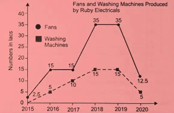
Ans. The line chart from Ruby Electricals above depicts the number of Fans and Washing machines produced from 2015 to 2020.
It is evident that Fans are the main product of the company as, at one point, 35 lacs were produced. Washing machines, on the other hand, only reached 5 lacs in both 2016 and 2020. Initially, a small number of Fans were made with the minimum production being 2.5 lacs then surged to 15 lacs in 2016 before levelling off until it skyrocketed to 35 lacs in 2018-19. 2018 and 2019 were the highest producing years for washing machines, being 10 and 12.5 lacs respectively.
However, 2020 saw a drastic drop to 6 lacs. It initially started at a mere 5 lacs in 2017, which astonishingly increased markedly to 10 lacs the following year. This remarkable slide from the peak of 12.5 lacs is difficult to explain.
It can be assumed that 2020 will go down as the lowest producing year for fans and washing machines so far.
Download the above Question in PDF (Printable)
Read another Analytical Paragraph Class 10 Solved Examples PDF
Question- 6 The Line graph given below represents Railway Finance from 2001-2002 to 2004-2005 (Northern Zone). It breaks down the gross revenue collected as well as the total expenses incurred during these years. Summarise and write an analytical paragraph highlighting the general trend and necessary details. Compare wherever relevant.
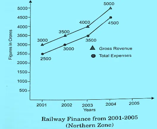
Ans. The line chart given above reveals the Railway Finance of the Northern Zone in the period 2001-2005.
It is showing both the gross revenue collected and total expenses incurred. There is a consistent rise in both categories, with no significant fluctuations. In 2001, 3000 crores was collected as revenue and 2500 crores spent on upkeep.
The next four years saw steady increases of 500 crores each year for both categories. Consequently, overall revenue collection rose by 66 percent over this time frame, ending up at 5000 crores in 2005. This same pattern of consistent increase was mirrored in the expenses during this period, reaching its highest point in 2005 with 5000 crore expenses incurred on maintenance and other related tasks.
Thus, the ratio between the two varied little from year to year without any dramatic changes.
Download the above Question in PDF (Printable)
Mastering Analytical Paragraph Writing Based on Bar Graphs
Here you will learn all about the analytical paragraphs based on Bar Charts
What is a Bar Graph-
A bar graph is a graphical representation of data using rectangular bars. The bars can be either vertical or horizontal, depending on the data they represent. Bar graphs are used to compare and contrast different sets of data and are one of the most popular types of data visualization.
They are especially useful for showing trends over time or for comparing numerical values within groups. With Edumantra’s analytical paragraph Bar Graph, students can easily practice for your Class 10 CBSE Board Exam. Following is the example of a Bar Graph-
Some Tips to solve analytical Paragraph Based on the Bar Graph
To write an effective analytical paragraph based on a bar graph, here are a few tips to keep in mind:
Writing an analytical paragraph based on a bar graph can be tricky but with some dedication, you can make sure your analysis is accurate and to the point.
- To begin, take a look at the bar graph and break it down into its individual components.
- Next, identify any trends or changes you can observe in the graph and then write down the data points or figures that support these observations.
- Finally, write a few sentences to explain your findings and draw conclusions from them.
With these tips, you’ll have a well-written analytical paragraph based on your bar graph in no time! Here are a few common phrases you can use to make your analytical paragraph look more professional-
• The given chart shows………
• This chart illustrates
• The data presented before us clearly states.
We find that from year XXXX to XXXX it remained in trend
Let’s take a look at the solved examples of Analytical Paragraphs for class 10 Board Exam-
Analytical Paragraphs Based on PIE CHARTS
What is a Pie chart- Pie Charts/Graphs represent data by using a circle divided into segments or sections. Each segment or section represents a certain percentage or proportion.
A Pie chart is a graphical representation of data in which the individual components are represented as slices of a circle. Pie charts can be used to represent various aspects of a data set, such as the number or percentage of particular categories or proportions between different categories.
It is an effective way of displaying information and making comparisons between categories easily accessible. With Edumantra’s analytical paragraph practice for class 10 CBSE Board, students can practice for the questions in the same pattern for the Board exam. Let see a few examples of the analytical paragraphs-
Analytical Paragraphs Solved Examples Based on Pie Charts
Question- 1- The following pie chart represents the distribution of the overseas tourists and their age profile respectively. Study the chart carefully and write an analytical paragraph giving the general trends and other necessary details. Don’ forget to compare the segments where relevant.
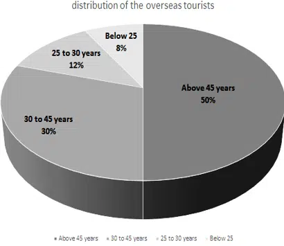
Ans. The analysis of the pie graph implies that the younger people are, the less likely they are to go abroad: with only 8% in the youngest age group. As we move up through the ages, the percentage of overseas trips gradually increases, reaching 12% for those aged 25-30 and 20% when combining both these age groups. However, it’s clearly evident that those between 30-45 years are much more likely to travel overseas, making up 30% of all tourists. The highest portion is obviously held by those above 45 – two out of every five travellers falls in this age group. This suggests that older folks not only have more free time and money for such journeys but perhaps a greater inclination as well. In contrast, younger people appear to lack either or both resources.
Download the above Question in PDF (Printable)
Analytical Paragraphs Solved Examples Based on Pie Charts – 4
Question- 2-An analysis of the pie-chart below illustrates how internet users aged 17+ browse the web most often. Write an analytical paragraph giving details and the general trend.
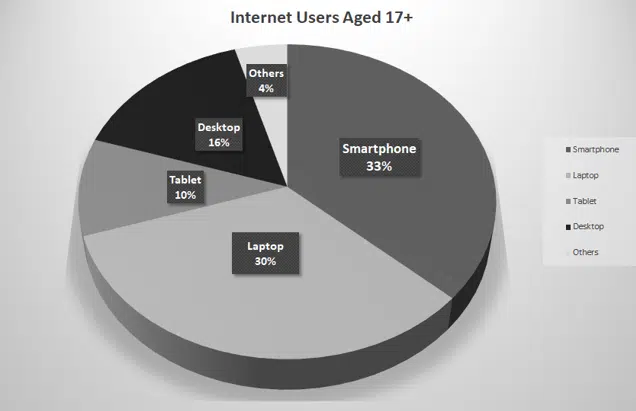
Ans. The survey reveals that internet users aged 17 and above have different preferences for browsing the web. Smart Phones are their most popular choice, with almost every third person opting for them. Closely following behind is the Laptop with thirty percent of users turning to it instead. Tablet users come in at number three, with one in five people preferring this option.
The Desktop Computer is next in the race, with fourteen percent of those surveyed expressing a preference for it. Other devices account for only four percent of use by people 17 and over. It’s clear that Smart Phones and Laptops are the favourites among this age group when it comes to accessing the internet, while Tablets and Desktops lag behind as far as popularity goes.
Download the above Question in PDF (Printable)
ANALYTICAL PARAGRAPHS ON NUMERICAL TABLES
Tips to solve the Analytical Paragraph based on Numerical Table
- Describe briefly what the given table is all about and what it aims to accomplish.
- As a result of studying the table, give the general trend/overall view that emerges.
- Don’t forget to compare or contrast things or items where relevant or necessary for your analytic interpretation of the table.
- Your analytical paragraph should conclude with a relevant but effective conclusion.
- Language should be simple, grammatically correct, and appropriate, with relevant words and phrases.
Question- 1- Write an analytical paragraph on the number of Corona Virus (COVID-19) cases across Indian states (as on May 1), 2020. Compare and contrast where relevant.
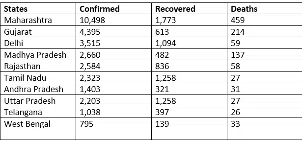
Ans. As of May 1, 2020, the following table lists the number of COVID-19-related deaths in various states of India as well as the number of confirmed cases and the number of people who recovered.
Maharashtra is the state with the highest number of COVID-19 infections (10,498), followed by Gujarat and Delhi at 4,395 and 3,515 respectively. Although Maharashtra and Gujarat top the list in terms of deaths, Madhya Pradesh surprisingly has more fatalities – 137 – than Delhi’s 59. Telangana remains on the lower end with only 1038 confirmed cases and 26 deaths, while Uttar Pradesh reports 27 deaths from its massive population.
Compared to USA and Europe, India appears to have weathered the storm relatively well so far. Maharashtra also leads when it comes to ‘recovered persons’ with 1,773 whereas Uttar Pradesh, Tamil Nadu, and Delhi have a decent number at 1,258, 1,258 and 1,094 respectively.
Despite all this, the situation in India due to COVID-19 still needs our attention; however a sense of panic isn’t necessary. With continued ‘Lockdowns’, we can work towards emerging victorious against this virus.
Download the above Question in PDF (Printable)
Question- 2- The given table records the number of employees working in Golden Automobiles in various departments from 2015 to 2019. Give an analytical description of the table in your own words. Also give necessary comparisons and contrasts wherever possible.
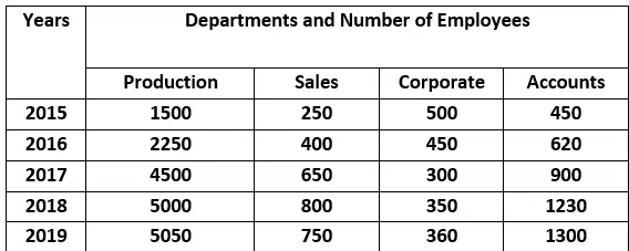
Ans. Over a five-year period, from 2015 to 2019, the table above illustrates the number of employees working at Golden Automobiles in various departments. The study also provides adequate data to compare how the numbers increased or decreased in Production, Sales, Corporate, and accounting departments.
Only the Corporate department is an exception. The overall trend indicates that the number of employees in Sales and Accounts is directly proportional to production.
In 2015, the production department began with 1500 employees. Its employees rose and fell independently irrespective of production figures. The lowest numbers were in 2015.
The Sales and Accounts departments had the least number of employees at 250 and 450 respectively. Comparatively, Corporate peaked in 2015 at 500 employees while production, Sales, and Accounts hit their lowest point. In 2019 however, it was 5050 in Production, 750 in Sales, and 1300 in Accounts that made up the highest number of employees excluding Corporate.
The latter hit its minimum count in 2017 with 300. It is clear that except for Corporate, Golden Automobiles’ staff level relies on production levels; when more is produced, greater employee numbers are required across Production and other related departments. The Corporate department stands alone as an independent entity unaffected by the demands of other working areas.